Ruffled Blossom by Stampendous; "Just because" from sentiment set by PaperTrey; Fabriano Mediovalis Paper (StarLitStudio on Ebay is an excellent source for 25 ct. packs of these lush Italian note cards with matching envies); Black Card Stock; Palette Hybrid in Noir; White Craft Ink by SU!; Water-based Markers; AquaPainter; Stitched Ribbon by SU!; Pigma Micron .05 for border detail; Antiqued Metallic Mini Brad (source unknown), Sakura Glaze Pen in Black
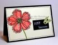
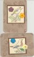
I scribbled a red water-based marker--more of a cadmium red in tone--onto a piece of plastic, and used that to load the color onto my water brush to color in this image. The blossom doesn't actually feature a stem, so I hand drew that with my Pigma Micron. When I finished this panel and mounted it onto the black card stock, it still seemed to lack some oomph. In part, because I didn't watercolor very well--I should have left a few more highlighted areas, and been a little sloppier. This doesn't look very "painterly" to my eye.
At any rate, to add some additional pizzazz to it, I drew the fine border. After pondering it some more, I decided to "intensify" the speckles by going over them with dots of Sakura Glaze Pen in Black. It's hard to see it in this photo, but the dimension and high gloss of the ink contrasts wonderfully with the watercolor paper--I was very pleased I took a chance and did it, by the time I was finished!
Date: Saturday, May 12, 2007 GMT Views: 2179
Favorited:50
Registered: June 12, 2007 Location: Oklahoma City Posts: 1513
Wed, Dec 12, 2007 @ 11:03 PM
I've noticed, as you mention, that I watercolor too neatly, like a prissy 3rd grader coloring within the lines. It looks much better when I am a little "sloppy" with greater color variations. Thanks for your expertise, and for your never-ending encouragement and education for beginners like me.