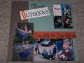
I really messed up my title, then made it worse by trying to fix it! Augh. Maybe I should leave the fancy-shmancy stuff to the professionals?? Right, Kristina?? :-)
Thanks for the inspiration!
Date: Tuesday, September 5, 2006 GMT Views: 474
Favorited:5
Registered: April 7, 2005 Location: stamping room with DGD Posts: 20207
Wed, Sep 06, 2006 @ 3:42 PM
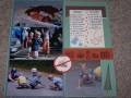
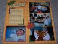
great scraplift! I am trying to figure out what you mean that you messed up - can't see anything wrong with this layout, I think it's great! great photos esp. in B & W; wonderful paper choice, cute ribbon
Registered: January 17, 2006 Location: CO Posts: 15634
Thu, Sep 07, 2006 @ 8:20 AM
what a beautiful page. I love the title and how you did that. Then I read your description and looked again at it and still didn't see ANYthing not perfect! Love it
Registered: June 27, 2006 Location: Salt Lake City, UT Posts: 116
Thu, Sep 07, 2006 @ 1:05 PM
This is great! Don't you just love those Fontwerks stamps?! I adore them.
Your page looks awesome! I must admit, I was inspired by a page that I saw in CK a while back when I made my page. It's so interesting to see the one in the mag, my page, and then your page... how each one progressed. It's like six degrees of separation!
------------------------------ ------------------
Check out my blog.