LIST: Colours (aqua, blue, green, white, yellow), Technique (ink blending, heat emboss resist), Elements (daisies, yellow dots, white frame, tall green stems)
INCLUDE: Colours (blue, green, white, yellow), ink blending, yellow and white flowers, white frame, tall green stems
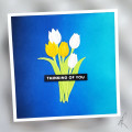
MODIFY: inkblending is vertical, rather than horizontal, flowers are tulips, not daisies, die cuts rather than stamped, grouped together rather than spread out. Added a sentiment, heat embossed the sentiment rather than the flowers
EXCLUDE: resist, texture on the background
SPIN: square card, stickles
So in 10 years, I'm happy to say that I think I'm better at inkblending! lol!
I used my 5 rules for getting a smooth blend:
1) smooth cardstock I use Hammermill 100lb Digital Color Copy Cover
2) blending brushes (I find these easier than blending foams)
3) juicy ink pads (Catherine Pooler inks are my go-to!)
4) lots of colours - there are 5 colours on this panel. It's easier to blend colours that are close together
5) lots of layers of ink - this cardstock was quite saturated with ink by the time I was finished!
The tulips and leaves were die cut from white cardstock and coloured simply with Copic markers.
Date: Sunday, January 23, 2022 GMT Views: 952
Favorited:4
This card is wonderful!! That ink blend background is luscious!! Thanks for sharing your tips for better ink blending. Hammermill is now on my 'want' list.