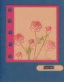
One of these days, I will learn not to try and upload card with any shade of blue card stock. This is Balletr Blue, but it surely does not look like it here.
Date: Friday, June 23, 2006 GMT Views: 2196
Favorited:82
Registered: August 9, 2005 Location: Tampa, FL Posts: 16812
Mon, Jun 26, 2006 @ 4:51 AM
This is absolutely beautiful! Scanners can be a royal pain! They truly do not do justice to the colors of a beautiful card, but I always find your cards gorgeous.
------------------------------ Jerri Kay My Gallery My Blog - A Touch of Grace Shout to the Lord, all the earth let us sing, power and majesty, praise to the King!
Registered: October 25, 2004 Location: Southern Oregon Coast Posts: 17641
Wed, Jun 28, 2006 @ 11:29 PM
Blue is very difficult and aggravating to scan or photograph, but your card looks just beautiful to me. The blooms, layout, vellum, ribbon--all outstanding!
Registered: July 22, 2005 Location: Beautiful - Lancaster County, PA Posts: 20277
Sun, Aug 06, 2006 @ 7:33 AM
You better not even THINK of NOT uploading EVERY single one of your creations! Ballet Blue or not.... they ALL look gorgeous! However, I do understand what you mean! I am upset when my colors look washed out or unlike the intended color. BUT.... please don't stop sharing!
This is gorgeous... and the BLUE is what made me come for a larger look!