Registered: December 1, 2005 Location: St. Louis, MO Posts: 477
Fri, Jun 16, 2006 @ 9:34 AM
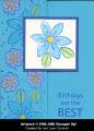
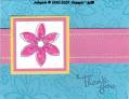
I love this and the other one I saw that you did the other day! I love this set, I'm thinking I'm gonna have to case it!! I personally like the small font. Got any more to share?!
------------------------------ Angie Britt...Mom to Allison & Jacob My SU! Demo Site My Blog
Registered: December 4, 2004 Location: Posts: 15802
Fri, Jun 16, 2006 @ 10:08 AM
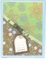
since you asked for constructive criticism, here goes. I like this card a lot. The colors are good and the layout is clean and simple. As you noted, I think the font needs to be larger to balance out the card. Other than that, you've got a winner!!
------------------------------ Dear Paperlicious is my blog...with a series on how I'm learning to improve my cardmaking by studying others.