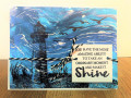
I loved the nautical feel of her first one with the lighthouse and scene and used the summery colors and sandy shore from her second one.
This idea also sparked from both last week's Teapot challenge to use red, white and blue for a non-patriotic card and also from watching Brenda Quintana's video for CASEing Tuesday. These color are just perfect for my husband's cousin's son's graduation card. His school colors are this navy and red roughly. The CASEing part helped me with the layout and adding that touch of red in the BG, which I love. These ideas tied in so nicely with Chrysi's cards.
Date: Thursday, June 4, 2020 GMT Views: 1752
Favorited:6
Ink: Real Red, Gray Granite, Pool Party, cool caribbean, Pacific Point, Garden Green, Granny Apple, Sahara, Versamark
Accessories: MFT Wonky stitched Rectangle dies, white EP, Classic label punch, candy dots, Up and Away dies (as a mask), blender brushes, HA stamp positiioner
Registered: December 4, 2010 Location: Minnesota Posts: 16610
Mon, Jun 08, 2020 @ 4:46 PM
Gorgeous nautical card Michelle. I especially love how you did not use a dark color on this lighthouse image, but used a light color instead. I have never used this lighthouse image before, but maybe I will now that I see what you have done. This scene is so inviting and inspiring and perfect for a graduation card. ~Karen.
Splitcoast Dirty Dozen Alumni Creative Crew SU Design Team Alumni
Registered: October 5, 2006 Location: Maryland Posts: 15773
Thu, Jun 11, 2020 @ 5:29 PM
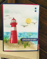
This was definitely worth the effort of lining up your lighthouse! Love the colors, the scene that you created and I am sure that your husband's cousin's son was thrilled! Hugs and tfs!