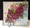
My first thought when I saw this design challenge was of the paper samples my Daughter-in-law and I had made practicing the color drop technique that she is learning for printing scarves. I chose this pattern because the design was tighter and reminded me of a volcano or fountain, spewing up into the air. I mounted the print on black CS leaving a narrow border that accents the black in it. It is on a Hello Honey card base which, surprisingly enough, is very close to the paint color we were using. The branch and flowers are die cut using Rose Garden thinlits and positioned as though they are stretching out between it and the viewer. The greeting is from the Hello You thinlits, cut in both Basic Black and Hello Honey. The black one is adhered on top of the Hello Honey one which is offset slightly.
Date: Tuesday, April 17, 2018 GMT Views: 224
Favorited:2
Registered: September 30, 2015 Location: Hawkes Bay, New Zealand Posts: 71
Wed, Apr 18, 2018 @ 1:36 PM
The background is glorious and I like your colour choices! Great explanation about your thinking processes. Thank you for sharing with us at As You See It, Eunice.
Registered: February 23, 2012 Location: West Kelowna, British Columbia, Canada Posts: 226
Wed, Apr 18, 2018 @ 2:36 PM
That background technique is so cool! What kind of paint or ink do you use? I like the yellow shadow on your sentiment, too! Thanks for joining us at As You See It Challenge!
Registered: September 10, 2013 Location: B. C. Posts: 5
Wed, Apr 18, 2018 @ 2:48 PM
Thank you for these wonderful comments. I think this is my favorite print of all the ones we did on paper. Maybe because I was so unsure of how the yellow looked as we were doing it, and ended up loving how it turned out. Heather, you would have to ask Krista about the paint. It is something she gets in a 'heavy' format and then treats somehow to make it usable. It was a trial and error process to begin with, lol.