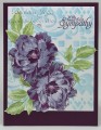
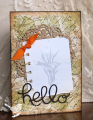
Karen is our hostess this week, and at least for me, this was really a challenging week, color-wise. Our colors are Blackberry Bliss (love it), Wisteria Wonder (meh), Soft Sky and Pear Pizzazz. The dessert option is sequins.
I expected Blackberry Bliss and Wisteria Wonder to go together so beautifully, but at least to my eye, they don't! My flowers are four layers—Wisteria Wonder, stamped off, then Wisteria Wonder full strength, then Blackberry Bliss stamped off, then Blackberry Bliss full strength. I did the leaves similarly with Pear Pizzazz ink. Then lots of fussy cutting. BTW, I tried several techniques for the layers, and must say that the MISTI is the champ at getting things lined up pretty darned perfectly.
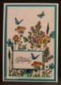
I tried out some new-to-me goodies, a beautiful new stencil and some wonderful brushes for applying Distress ink. They make it so easy to get a beautiful result without sponging.
After I decided the flowers were somber enough that this should be a sympathy card, I was a bit reluctant to put sequins on it. But then I tried a few neutral-colored sequins in the centers of the flowers, and one above, and I decided I like them—maybe almost like teardrops.
Registered: September 3, 2007 Location: native Texan living in extreme N. GA Posts: 73388
Wed, May 04, 2016 @ 7:06 AM
How lovely, Barbara! psssttt...I'm w/ you, to my eye they don't really go, either. One is cooler w/ blue undertones & the other is warm w/ red undertones. You did a beautiful job using them together. Your flowers are amazing.