Great inspiration challenge today has us taking a look at pleasing palettes.
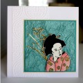
Thank you Audrie for the beautiful Asian image. I thought it would fit perfectly with my selected palette, #9 ... refreshing and pretty. I wanted to keep things unencumbered, so a smaller size image was in order. Yours worked perfectly.
Surprisingly, I gravitated to 'refreshing and pretty'. I say surprising because it's so not my style. I'm all about black, gold, more black and then more gold. I love things in perfect harmony. I don't necessarily perceive #9 as being in harmony for me but it was definitely appealing.
The colors are 2 shades of turquoise, yellow and pink. Got those covered with layers and the kimono. I added a Magenta Asian sticker gifted from Anne Dodd a few years ago.
TFL
Date: Saturday, February 13, 2016 GMT Views: 1528
Favorited:10
Registered: February 24, 2008 Location: MN Posts: 11427
Sun, Feb 14, 2016 @ 7:15 PM
For a gal that loves perfect harmony you sure show it on your cards....It's nice to see some of the "old ones" still on here....Oh Yah! A beautiful card too..
Registered: June 29, 2004 Location: Sugar Land. Texas Posts: 79473
Sun, Feb 14, 2016 @ 8:29 PM
Love this classy card and love the choice of colors That gold completes this card in such a perfect way!
------------------------------ LizThe joy of the LORD is my strength.Right Brain Madness --My blogProud member of the redDivasKSS certified multi-step stamperFan Club member since 2004