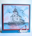
There was a tiny bit of confusion and some of us on the team have a slight variation of the colors. I am one of the ones that used bashful blue, marina mist, and calypso coral. The bashful blue was changed to soft sky - fairly similar. Anyway, I added a bit of neutrals also - brown and black. It was another fun color challenge. Thanks Vicki!!
Date: Monday, July 22, 2013 GMT Views: 870
Favorited:3
Registered: August 15, 2007 Location: Twin Cities MN Posts: 50417
Tue, Jul 23, 2013 @ 7:51 AM
I always love lighthouses on cards..this scene is peaceful and works well with today's colors. I like how you did the twine in a triangle like a sailboat...cool detail!
Registered: April 4, 2008 Location: Sahuarita, Arizona originally from New Brunswick, Canada Posts: 18436
Tue, Jul 23, 2013 @ 9:50 AM
what a wonderful use of todays colours Kim.... love the gorgeous scene you have created with the beautiful clouds and sponging...also love how you used the twine with your sentiment..... very well done... love it...
Registered: February 5, 2007 Location: St. Louis, MO Posts: 92378
Tue, Jul 23, 2013 @ 11:22 AM
Lovely lighthouse card and excellent use of the chosen colors, Kim. I grew up on a great lake with a town that had a distinctive lighthouse....so I'm partial to these scenes.
Registered: March 24, 2012 Location: West Virginia Posts: 1241
Tue, Jul 23, 2013 @ 9:13 PM
Awesome card . Love this lighthouse image. I love the sentiment tag, and the way you attached it to the card, is perfect, slightly off center. Perfectly beautiful. tfs.
----------------------
Marg.