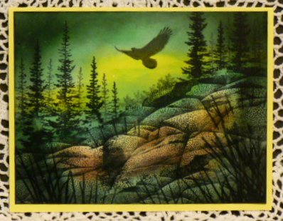
After being somewhat frustrated with the blue lighthouse scene, I decided to try again with something different. This scene was actually a lot more difficult, with more elements and multiple stampings, and using more colors.
I did sort of follow a sample Stampscapes scene for the basic composition, making a few changes. This time I used a piece of computer paper the same size to test the placement of each element before stamping on the glossy paper.
I'm quite pleased with the results which encourages me to keep trying to improve the technique.
I gave this a difficulty rating of 5 because that's how hard it was for me. Perhaps in a few *years,* I'll consider this a less difficult scene to create. I received help from Kevin's (Stampscapes) videos on coloring.
Date: Tuesday, February 12, 2013 GMT Views: 2998
Favorited:11
Registered: May 25, 2006 Location: So. Oregon Posts: 121623
Thu, Feb 14, 2013 @ 7:22 AM
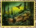
if this is an attempt that you are not thrilled with, I look at it and shake my head because, the depth of color on this is STUNNING Val.
this is something I want to get better at and Im tossing this into my fav's to see these colors again.
tfs!