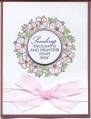
I was not going to post this, but maybe I will save disappointment for someone else. I used Brilliance for the background square stamp. I love the look of it, but then I stamped the black with Memento ink for the flower and words and they do not show up very well. So instead of an impressive looking card, I have a quiet subdued color combo! TFL
Date: Sunday, August 21, 2011 GMT Views: 1041
Favorited:9
Registered: June 28, 2009 Location: I live on the outskirts of Windsor, Colorado with my wonderful husband and our furry daughter, Sasha Posts: 34
Sun, Aug 21, 2011 @ 7:03 AM
I can understand from your point of view the card didn't turn out the way you envisioned, but as a viewer, I think it is very simple (simple in style, not in technique...it is time consuming to line up a stamp in succession), but classy.
Great job!
------------------------------ Life's not about waiting for the storm to pass, it's about learning how to dance in the rain.
Registered: July 26, 2005 Location: Coastal Georgia Posts: 2430
Sun, Aug 21, 2011 @ 8:15 AM
I agree with serickson. Quite classy and stylish. I don't know that the really black would have given a better look. If you want to try, use India Ink. It's really black and dries very quickly. Personally I love what you've done!
------------------------------ Keep what is worth keeping
and with the breath of kindness
blow the rest away.