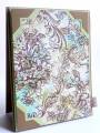
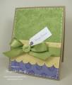
I just love the color challenge. Today was celery, turquoise, and soft suede. Betty shared her inspiration with us by leaving a picture of Vera Bradley purses. I saw this working pretty well. Like a lot of times, my card looks better in real life. Ya ya!! :>)
Have a great day!!
Date: Tuesday, April 6, 2010 GMT Views: 1048
Favorited:5
Registered: November 3, 2005 Location: Fairport Harbor, OH-IO, Lake Erie shoreline Posts: 59967
Tue, Apr 06, 2010 @ 11:19 AM
This is very pretty on my puter screen, so I know it would knock my socks off IRL! I like the splashes of color to the image and the photo corners are great.
------------------------------ Karen ~ Thanks for stopping by my gallery. Proud Fan Club Member - FS525, QFTD49 Life is better in a beach town!
Registered: April 18, 2009 Location: Boston suburbs, MA Posts: 14060
Tue, Apr 06, 2010 @ 5:16 PM
Kim, I just adore this!!! Wow, you captured that Vera Bradley fabric so very nicely with this card. I love your layered photo corners and how you used them in 3 corners with a ribbon tab in the fourth. Super job using the challenge colors
------------------------------ ~ Emily ~ My BLOG
My kids are on SCS: ponyluvingirl (age 14) and Legoboy (age 10)
I'm a Punchkateer! ~ I design for DeNami Design Rubber Stamps


 TFS!!!!


