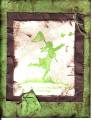
scan makes it a bit darker. the brown i used is close to cocoa but the scan makes it look like chocolate chip. the main image didn't scan well either. oh well!
Date: Monday, October 3, 2005 GMT Views: 642
Favorited:2
Registered: October 9, 2003 Location: Eaton Rapids, Michigan Posts: 1282
Fri, Jan 06, 2006 @ 10:47 AM
BH Thread - I think there's too much distressed paper. Maybe replace the stapled on paper with twill tape. Not sure about that green color, but it could just be the scan.
Registered: May 2, 2004 Location: Far, far away Posts: 24216
Fri, Jan 06, 2006 @ 1:41 PM
Honesty thread: If it is celery and choc chip I bet it looks fab because that's my new fave combo! I don't think the scan does this justice. Maybe the girl should be stamped in a darker colour to make her stand out more? I agree there's a bit too much crinkling (for my taste), and would perhaps half the width of the cocoa layer and just have it under the left half of the main image. But that's just me.
Registered: July 13, 2004 Location: Grasonville, MD Posts: 7632
Fri, Jan 06, 2006 @ 2:39 PM
Brutally Honest..... I think it is just your scanner that is the problem. I like the card and can imagine it with the soft colors (as others have said it is coming in as Green Galore & Chocolate Chip).
Registered: December 10, 2004 Location: in a seaside cottage in Maine, IRL off the Beltway in Northern VA Posts: 1608
Sun, Jan 08, 2006 @ 6:46 AM
Honesty thread... WOW the scan really does distort the colors I love the combo of greens and browns so I am sure IRL this rocks. The one suggestion is maybe a little less distressing and maybe a border (brown?) around the tags, they tend to blend in with the background.


 I love the combo of greens and browns so I am sure IRL this rocks. The one suggestion is maybe a little less distressing and maybe a border (brown?) around the tags, they tend to blend in with the background.