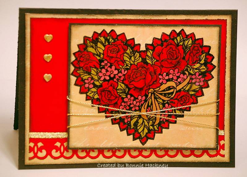
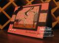
I named this card "The Cursed Heart" because if anything went wrong, IT WENT WRONG! This is the image that I had a fight with for the Limited Supplies Challenge which I never got done until now. I had to set it aside for a couple of days. When I saw the Featured Stamper Jaydekay's gallery tonight, I knew I had to case this card shown here. ssnotime37 simple butterfly by jaydekay at Splitcoaststampers. Thank you so much for making her as the FS. Here is my story.
I started out by stamping the heart with versamark ink onto vellum. I used black emboss powder and heat set. Colored with markers on the embossed side. Cut out! This is where I had a fight, because every which way I put it, it didn't look right with anything for the LSC. So, here it is in the FS. I mounted the image onto a scrap of dp (it really does have fainted hearts in it, hard to see) and sponged with black ink around the edges. Mounted on black. I added gold cording across the front and mounted it using 3D pop dots. It's a little bigger than what Jaydekay has, but I thought it worked well here. At first, I had regular rhinestones, but I changed them to hearts which I embossed gold. I had to make 2 separate pieces. Long story about the red background. I'll make it short. I ran out of my favorite red, and this is the only piece I had left with the sponged black on it. I hope it looks ok. Then I took another piece of scrap of the same red and used the decorative heart punch and added gold ribbon to hide the seam. Didn't I tell you that this is the heart image that wanted to win the fight? Well, I think I won, because I used it tonight, plus it's in 2 challenges. Thanks for the challenges. What do you think? Your comments are appreciated, please be honest! Thank you!
*I bought this stamp at a garage sale for 25 cents, otherwise I don't think I would of ever bought it myself.*
Things I changed for the FS: 5x7 card, heart brads, image, decorative corner punch
Thank you for looking!
Bonnie
Date: Sunday, January 11, 2009 GMT Views: 949
Favorited:5
Registered: March 11, 2008 Location: Sacramento, California Posts: 39766
Sun, Jan 11, 2009 @ 2:06 PM
Honestly......I think this is gorgeous! I love the colors! It is so bold and bright! You for sure won the fight with this image! Good for you! Glad you kept going, because it was well worth it. This card is beautiful! TFS :0)
------------------------------ Cathy B aka: Mutnik ....or is it Nutmeg?! I get so confused!
Smile.......people will wonder what you are up to! :0) Proud Fan Club Member 2010 DT forRubbernecker Stamps My Gallery
Registered: November 3, 2005 Location: Fairport Harbor, OH-IO, Lake Erie shoreline Posts: 60035
Sun, Jan 11, 2009 @ 4:24 PM
I'll tell ya Bonnie, this was worth the hassle. It's gorgeous. You did fabulous. I'm glad you waited instead of tossing this in the round file. I do that a lot then wonder what I did w/ this or that. Beautiful card.
------------------------------ Karen ~ Thanks for stopping by my gallery. Proud Fan Club Member - FS525, QFTD49 Life is better in a beach town!