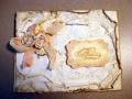
Mary Marsh gave us the following vibrant colors for todayÂ’s Color Challenge:
Pacific Point
Daffodil Delight
Rich Razzleberry
The dessert was to add a brad or button with a summery theme. Since I didnÂ’t have an appropriate one, I didnÂ’t add one.
I decided to use todayÂ’s colors in inks with a brayer. Obviously, you can see the blue and yellow. I forgot color theory when I added the Plum Pudding ink over the yellow. Complementary colors cancel one another out and I ended up with a more burnt sienna tone than true plum. I always brayer light to dark when I use this techniqueÂ…..maybe this time I should have done a corner in the Plum Pudding before the yellowÂ…..but I doubt that would have worked either. IÂ’ve been gone this week-end so I ran out of time to do another. : (
It’s been fun being a guest designer this past month and I thank Betty Wright for the opportunity….and all the “color ladies” who gave us wonderful color combinations to work with. : )
TFL
Date: Monday, May 30, 2011 GMT Views: 6302
Favorited:101