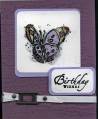
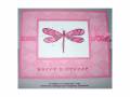
This layout was taken from page 139 of the current IB&C. They used Bravo Burgandy, Bashful Blue, Marigold Morning, Old Olive and Vanilla.
I simplified it a bit and went with only 3 colors. I also added 2 extra buttons for "balance".. IMHO it needed it! LOL... besides, I had to cover up a "goof".
Thanks for the challenge! I suck (yes, I said suck, can we say that here?!) at casing, but this made me feel better about it.
Date: Monday, August 7, 2006 GMT Views: 1912
Favorited:37
Registered: July 22, 2005 Location: Beautiful - Lancaster County, PA Posts: 20277
Tue, Aug 08, 2006 @ 4:44 AM
WOW.... GREAT look in these colors!! AND, what a fantastic difference your addition of the b/g and IBB makes on this card out of the catty!!! GREAT JOB!!!! (oh... and, I like your fold!)
(the gallery would NOT work for me last night.... lots of catching up to do this morning!!)