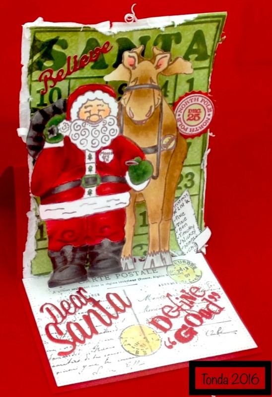
What are the chances? I've worked on this card all weekend and was going to upload it and the CC has been posted. I added a curry postmark and think it will fit in this weeks color challenge. I Believe!
The Santa and moose (were free stamps from friends who didn't want them, what a find), and they are on a pop out, so they stand away from, the Sizzix bingo card ebf. The pop out is scored at 1/2 inch intervals (1/2, 1, 1 1/2, 2, 2 1/2, so you have 5 sections. Make a box a taped one section to the Santa and one to the bingo card. That way it fold flat for mailing. I used to to do this a lot and then kinda of forgot about and started using mounting tape but this is definitely cheaper for mailing)
Dies are Penny Black-Dear Santa, MFT pierced rectangles, believe is Memory Box, Sizzix pinking die
I want to thank #1artist4highhopes and if you haven't checked out her gallery you use should. this is a link to her gallery crissyarmstrong's Gallery at Splitcoaststampers
She shared her red colors with me and they are fabulous.
Copic
Face E0000,000,00,93
Suit R21,14,24,27,29,89
Black, T0,1,3,5,7,9,110
Green G20,24,28,29
Fur. E40,41
Moose, E30,31,35,29,27
Hoof E00,30
Ears E02,R01
Thanks for looking.
Date: Monday, December 12, 2016 GMT Views: 949
Favorited:11
Registered: May 7, 2008 Location: Sioux City, Ia Posts: 5837
Wed, Dec 14, 2016 @ 6:22 AM
Tonda,this is just wonderfully fun. Your attention to detail is pretty awesome. This is one of those cards you just have to look at again and again to take it all in. Just love everything about this.
How sweet of you to give kudos to #1 artist4highhopes.
Registered: June 4, 2009 Location: Deatsville, Alabama Posts: 83136
Sun, Dec 18, 2016 @ 3:35 AM
I love everything about this cute card from the way you colored up the reindeer to the distressing. Fab card my friend. Hugz
------------------------------ Nancy Williams - Hope your day is Spirit-filled and ink-filled (in that order)!DRS Designs-DT, Punchkateerforever, Dirty Dozen Alumni
Registered: May 2, 2006 Location: Northern Ontario Posts: 15152
Sun, Dec 18, 2016 @ 4:58 AM
Great job on the colouring! I think you're doing well! If I had a constructive critique, I would say, just leave some highlights showing more - it is tempting to colour over them and blend them out, but leaving them showing will work wonders with giving it that velvety look. Same with the darkest reds - don't overblend, or they go from dark tones to mid-tones. The idea is to have the full range, from red that is almost a black red to red that is almost a light pink red. You're off to a great start here though! I'm impressed! The card is fantastic. I love pop ups!
------------------------------ Crissy Armstrong
My SCS Gallery My BLOGwhere you can find more card details and links to my images as well as some videos I've made of my colouring process.