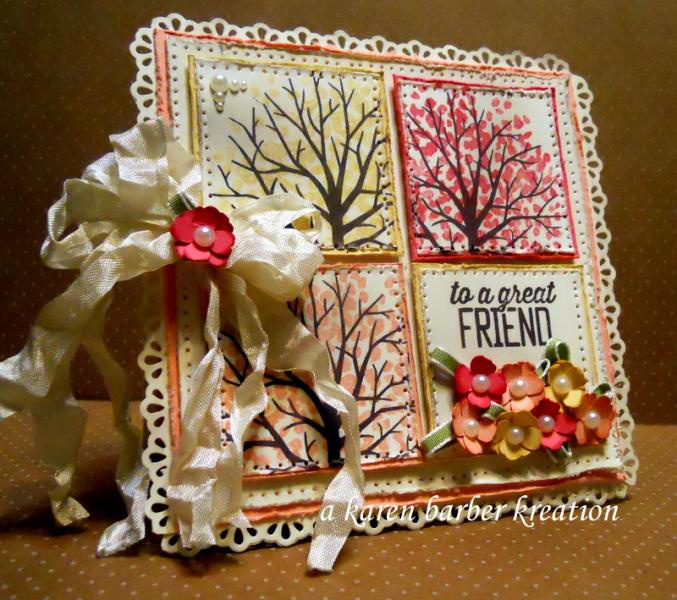
This was one of those cards that looked better in my head then when I put it on paper, if you know what I mean. I'm not overjoyed with it. I should get my DIL Jenna to shabby chic inspect it for me or critique it I mean....or something....too much color? I can't put my finger on it but it was somehow softer in my head. haha. I did sneak dessert in there, because I think FRIENDS are sweet. oH well, it is what it is. Off to bed with me. I am what I am, and that is TIRED. Happy Tuesday everyone!
Date: Monday, March 30, 2015 GMT Views: 3753
Favorited:17
Paper: VERY VANILLA, CRISP CANTALOPE, STRAWBERRY SLUSH, SO SAFFRON
Ink: EARLY ESPRESSO, CRISP CANTALOPE, STRAWBERRY SLUSH, SO SAFFRON
Accessories: BIG SHOT, ADORNING ACCENT TRIM, PAPER PIECING KIT, WHITE GEL PEN, FLOWER PUNCH, PEARL BLING, IVORY SEAM BINDING, PAPER SNIPS FOR DISTRESSING
Registered: April 22, 2005 Location: Boca Raton, FL Posts: 14382
Wed, Apr 01, 2015 @ 6:42 AM
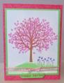
What a beautiful Spring in full bloom! Love these sweet blossoms, Karen. Always so much texture and things to draw in the eye on your cards. Just beautiful .