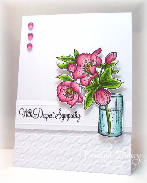
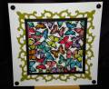
Congratulations to this weeks Featured Stamper, Maureen, aka mamamostamps! Maureen's clean style is just what I needed to inspire me for a sympathy card and I chose her card found HERE. I kept the layout with the houndstooth embossing across the bottom but changed it to a white bg. I also changed it by adding my sentiment with a scored and popped up panel and colored the image instead of using a stamped silhouette. I'd always thought that lenten roses were a pale pink until I checked out photo's on the internet and saw there were some which were a deep, deep pink which is what I went for.
Date: Saturday, August 18, 2012 GMT Views: 4527
Favorited:47
Registered: September 2, 2007 Location: Posts: 877
Sun, Aug 19, 2012 @ 10:34 AM
This card is a touch of class for sure. Your coloring is outstanding and the embossing folder on the bottom and scorpaled strip make it looked absolutely wonderful. I think you enabled me to buy this stamp set. TFS
Registered: March 9, 2005 Location: OH Posts: 28553
Sun, Aug 19, 2012 @ 11:10 AM
Bridget, this is a gorgeous card. Love your coloring and colors.
------------------------------ My Blog- Trusting in the Lord for Everything Proverbs 3:5-6 Trust in the Lord with all your heart and lean not on your own understanding. In all your ways acknowledge Him and He will make your path straight. My Stampin' Up WebsiteMy Gallery, BRAK New Member Mentor. New Grandmother to Mia Lou. 1st Grandchild.
Bridget, Your card is positively stunning. Thank you for drawing our attention to Maureen's gorgeous gallery. I really enjoyed myself browsing through her work.
Registered: November 3, 2005 Location: Fairport Harbor, OH-IO, Lake Erie shoreline Posts: 60343
Sun, Aug 19, 2012 @ 4:57 PM
Bridget, what a beautiful creation. you've just 'got it'.
Your choice this week is amazing. I was not familiar at all w/ Maureen, but I felt like I wanted to case each card!! Her gallery is full of inspiration.
------------------------------ Karen ~ Thanks for stopping by my gallery. Proud Fan Club Member - FS525, QFTD49 Life is better in a beach town!
Registered: August 14, 2007 Location: Beautiful British Columbia Posts: 30863
Sun, Aug 19, 2012 @ 5:23 PM
What a vibrant, stunning and beautiful card, Bridget. I practice and practice with my copics....but it is an uphill battle for me....I'm certainly not a natural. Your colouring is simply awesome!!
------------------------------
Jo
Proud Fan Club Member
...sure it�s got a catchy beat, but can you stamp to it?
life is something that happens only when you run out of cardstock
Registered: April 13, 2007 Location: Milford, PA Posts: 971
Sun, Aug 19, 2012 @ 5:39 PM
Oh Bridget, this is stunningly beautiful! Your image is perfectly colored and pops against all of that white space. Thank you for choosing me as the Featured Stamper, it is truly an honor!!
Registered: October 21, 2010 Location: in the okanagan in b.c. canada Posts: 13012
Sun, Aug 19, 2012 @ 5:48 PM
First I am sorry you need a sympathy card. they are hard. but I really love the color you DID choose to use it stands out so nice with that crisp white bg.. Beautiful coloring and love your idea of popping out the sentiment...jsut beautiful...TFs..:0)
------------------------------ We as people are raindrops of colorful ink , falling down Crisp and Clear, each a different shade more vibrant then the last, but once we realize at the bottom of an endless abyss we all fall into the same inkpot forming one color, only then can we come together as one My son.