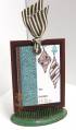
I kept the layout
I tried to do the crisscross embossing pattern look with a texturz template
I used three little pearls in the bottom right corner instead of brads.
I changed colors, stamps, and I used NO dp....stamped my background and embossed the other panels. I did add some ribbon with hardware and a corner accent.
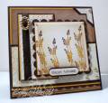
This card is also for the Raspberry Suite Color Challenge #16. The required colors are dark chocolate, summer sunrise, vintage cream, and kraft. Wonderful warm colors choices, Dawn!!!
Please check out this blog post to find out more about my dry sponging I did on the background panel as well as more card information. Thanks so much!
Stamps
PTI Life, Mailbox Greetings, Spots and Dots
Paper
PTI dark chocolate, vintage cream, kraft, summer sunrise
Ink
PTI dark chocolate, vintage cream, kraft, summer sunrise, Ranger Antique Linen
Accessories
Nestabilities, cuttlebug ef, SU texturz plates, EK Success border punch, photo corner punch, dark chocolate twill ribbon, ribbon slide, gold pearls, sponges, glue dots, word window punch, foam squares
Date: Sunday, September 6, 2009 GMT Views: 1105
Favorited:17
Registered: April 20, 2005 Location: The only Eaton Rapids on the Earth, Michigan Posts: 57568
Sun, Sep 06, 2009 @ 7:17 PM
Betty, this lovely creation is absolutely gorgeous!! I love how you matched the criss cross pattern on your bg and photocorner punch and how you added the word window sentiment. Beautiful fall colors!