I kept the same simple style using a plain white cardstock base and adding color with simple designer paper and sweet simple images with the addition of just a few more embellishments. I always seem to have to a little too far...thus clean and Julie's simple is very hard for me. I believe it is a far more difficult style to pull off than most believe.
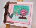
I kept Julie's pink teacup theme but added another cup and a couple of cupcakes to my project as well as two sweet little napkins. If you want more deets on this project check out my blog post. http://kittiekraft.typepad.com/kitti...ubberness.html
Stamps: Anna Wight's Good Times and Sweet Expressions
Paper: White, TemptingTurquoise, Retired SU
Ink: Stazon, Regal Rose, Close To Cocoa, Going Gray
Accessories: Grosgrain, Nestabilities, SU Scalloped Punch, 1/8" Hand Punch, Mounting Tape
Date: Sunday, January 4, 2009 GMT Views: 688
Favorited:6
Registered: November 7, 2006 Location: Willamette Valley Oregon Posts: 34508
Mon, Jan 05, 2009 @ 2:03 AM
oh, I so agree with you, Kittie about the clean and simple style. Which is why I find it so appealing. Your card is perfect for Julie, though and I adore those napkins!!!
------------------------------ Susan~~~One4Joydaily I'm a FAN CLUB member, U? MY GALLERYof visual Delights MY BLOG