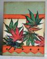
The techniques as Beth said, doesnÂ’t photograph real well but it sparkles up nice in real life and well worth the efforts. I used the Pearl Ex and hairspray and added More Mustard liquid ink to it in stages so IÂ’d get a variation of color. The color does show better in real life; itÂ’s a little light in the photo.
Find the challenge here
-The leaves are colored with Prismacolor pencils and baby oil.
-The out of the box leaf is a cut out, I embossed the veins from the back side as I held it up to the window cushioned by a paper towel.
-Then these were sprayed with the glimmer solution.
-The dragon fly is colored with H2oÂ’s, cut out and I also ran a black marker along the edge to hide the white. Glue was applied only on the body portion.
-Ink distressing was done on all panel edges and a few faux stitches.
Paper: Stampin Up – Mellow Moss, Orange, retired graffiti
Ink: StazOn – Jet Black, Ranger/Tim Holtz – vintage photo distress ink, Stampin Up classic – Mellow Moss, More Mustard
Accessories: SU - Mat pack, MM - paper piercer, Pearl Ex, hairspray, H2os, artist brush, mist bottle, brads, Martha Stewart border punch, markers, tape, sponge
Registered: August 7, 2007 Location: North Carolina Posts: 28113
Mon, Jun 16, 2008 @ 5:45 PM
Roxi this is just beautiful! Love the richness of color, the arrangement of the leaves, dragonfly, and all the little touches... love that fancy border... and I can see the glimmer! Gorgeous!
------------------------------ MY GALLERY My BLOG
No card is complete without at least one cat hair
DT: Our Daily Bread designs
Happily a Fan Club Member Romans 6:23
Splitcoast Dirty Dozen Creative Crew SU Design Team Alumni
Registered: January 7, 2007 Location: Southern California Posts: 42871
Mon, Jun 16, 2008 @ 6:23 PM
Wow, Roxie, this is great. Your coloring and distressing inks add so much dimension to this. The shimmer on the leaves make them appear softer in the photo.
------------------------------ Kathy Stamp n Sip with me