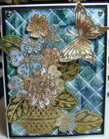
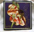
The BG is PTI white, scor-pal on the diagonal then craft ink spots (navy, hunter, ballet blue) lightly applied to the raised area and embossed with clear EP. It's very shiny IRL and looks like real tiles.
The indulgence-I knew you were going to ask- is that the pink flowers are from the Schann's catalog and were scoops of ice cream! See the cherry chips in the butterfly? The blue is sky.
Date: Monday, March 10, 2008 GMT Views: 3388
Favorited:27
Registered: August 7, 2007 Location: North Carolina Posts: 28113
Mon, Mar 10, 2008 @ 7:29 PM
WOW!!! That's all I can say! I love everything about this card... the "delicious" colors, the flowers and vase and the whole composition is just breathtaking! TFS
------------------------------ MY GALLERY My BLOG
No card is complete without at least one cat hair
DT: Our Daily Bread designs
Happily a Fan Club Member Romans 6:23
Registered: June 28, 2006 Location: Southern California Posts: 460
Mon, Mar 10, 2008 @ 7:48 PM
This looks like it took some time, but well worth the effort. I love how you created the tiles and how all the elements come together. The result is stunning!
Registered: January 28, 2005 Location: Posts: 25783
Mon, Mar 10, 2008 @ 8:10 PM
Breathing here!!!!! I am rendered absolutely speechless!!!!!! This is a work of art with ice cream to boot!!!!!! Gorgeous, gorgeous, gorgeous!!!! This needs a frame!!!! Stunning!!!!! Beautifully done!!!!