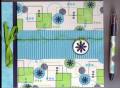
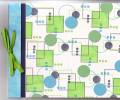
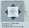
I am at a loss with this set. I am making a matboard journal for someone at work to give her 17 yr old niece. She wants it in lime gree, navy and turquoise and wants a retro look (she said shapes would be good...this si the first set that came to mind). Ok, this is NOT my style at all and it does not look retro in my opinion. What do you recommend that I can do to this? I was thinking, after looking through the gallery, that maybe some crimped turquoise paper across the middle would look better? What else? I did put glitter on the small freen circles in hopes of making it look more girly. PLEASE HELP ME...I need this done for tomorrow.
Date: Sunday, December 12, 2004 GMT Views: 1857
Favorited:8
Registered: October 15, 2004 Location: Florida Posts: 3089
Sun, Dec 12, 2004 @ 2:24 PM
I like it. Since you don't know her name, and the stamp set that you have is too large to set type in. How about printing something out on the computer using su! card stock and a retro alphabet. Maybe..My Journal..or something. Adhering it to the lower right hand corner,maybe
------------------------------ "In the end, it's not the years in your life that count. It's the life in your years." Abraham Lincoln
Registered: March 1, 2003 Location: Vancouver,Wa Posts: 662
Sun, Dec 12, 2004 @ 2:46 PM
I like it just like it is, your just not used to this style but you captured it perfectly, Im with beate her name across the front, maybe with metal letters in circle shapes!
------------------------------ Don't Dream it be it!
Registered: May 13, 2004 Location: Freehold, NJ Posts: 2648
Sun, Dec 12, 2004 @ 3:34 PM
I think it is lovely, too. A 17 yo probably doesn't want too girly girl - I think this is great. A Wonderful Word layered on crimped turquoise wouldn't hurt ...
Registered: June 15, 2004 Location: Leesburg, VA Posts: 440
Sun, Dec 12, 2004 @ 3:42 PM
What if you added more fibers, instead of just the grosgrain? Something fluffy, with a kinda feather boa look? And maybe the widget (*) from Word Play or Bundle Up (or their matching wheels) on the cut-out circles? That would do the "flower but retro look" I think.
Registered: October 21, 2004 Location: SE Wisconsin Posts: 1329
Sun, Dec 12, 2004 @ 3:49 PM
I love it but if you want to change it, make it a little more random and alternate colors of squares. It will flow more freely then, but it's very nicely done, for sure
Registered: June 13, 2004 Location: Flemington, NJ Posts: 3860
Sun, Dec 12, 2004 @ 4:23 PM
DO NOT change a thing!! I would give this to a 17 yr old girl in a heartbeat - very retro and unisex but on the feminine side. I would change the turquoise to a darker blue for a boy, so it is on the feminine side (IMHO). She is going to LOVE this!!
Registered: February 2, 2004 Location: Madison, IN Posts: 1088
Sun, Dec 12, 2004 @ 5:07 PM
I like it too. I like the idea of printing off a title like "my journal" onto su cs. Do you have any fancy fibers? How about adding some of those around the title or just replacing the grossgrain with the fancy fibers. GREAT job though. I like it.
------------------------------ Angie
Mother of three wonderful children (Brayton-17 months, Brianna- 5 & Kyle-eight) and one grown man (my DH).
We made a card similar to this at my upline's Stamp a stack , and we put coordinating words from Everyday Flexible Phrases......it did the trick! HTH
Renee