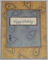
This little set is sadly in my top 5 least favs. I am very challenged trying to make masculine cards so I thought I would do that. I don't like working with Dazzling Diamonds for the messiness or with staples, but they didn't go with this card. Darn! I guess I'll try another one!
The linen is in creamy caramel on both the bordering blue and small creamy caramel layer but you can't see it in my picture really-sorry!
Date: Monday, January 8, 2007 GMT Views: 1831
Favorited:62
Registered: October 24, 2004 Location: Kathleen, GA Posts: 805
Mon, Jan 08, 2007 @ 9:03 AM
I love how the big paislies on top of the Paisley BG make it look like ghosting. Great job! Did you use bord blue ink with the Linen BG on bord blue CS? TFS