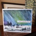
I really enjoyed this, except for painting the bottom part. That was hard for me and I thought I'd done a pretty poor job. But when I started adding the trees, it made more sense and now I like it quite well. I need to work on getting a brighter green....maybe yellow added to my green?? I also added a little graphite for shading and a bit of WOS for shine. I left out the snow because (correct me if I'm wrong), I don't think you'd see the northern lights if it was snowing. Wouldn't it be cloudy???? I used some white ink for snow on the trees. I so would love to see them in person.
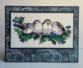
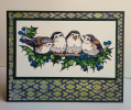
This is also for F4A571-a sympathy card. I tend not to make sympathy cards as such, I prefer to send a pretty, calm, serene card with a handwritten message. 'With Sympathy' is ok but most store bought cards are too gushy, sorry for your loss, how wonderful the person was, that kind of thing. I don't consider death a loss if you hold on to the memories. The price of love, as they say.
Date: Friday, January 29, 2021 GMT Views: 715
Favorited:4
Registered: October 19, 2007 Location: Packer Country, WI Posts: 72090
Fri, Jan 29, 2021 @ 3:19 PM
Beautiful with your northern lights. You are right, it wouldn't be snowing with a clear sky...you do need clouds. Maybe they can be stars. Lovely card and thanks for playing this week.
Registered: March 8, 2005 Location: Halfway between Dallas and Houston Posts: 24020
Fri, Jan 29, 2021 @ 8:14 PM
Your scene is beautiful, Jean. I thought that about the snow as well, but I did sort of like the look of the added snow. Now that Kia has explained all of the properties of the lights to us. I want to go visit there and just sit around watching the lights! Then we all would be able to paint beautiful scenes of them from our memory.
------------------------------ Proud Fan Club Member
Dirty Dozen Alumni
"Art washes away from the soul the dust of everyday life."
Registered: February 23, 2016 Location: El Paso, TX Posts: 22987
Sat, Jan 30, 2021 @ 9:30 AM
The first thing that caught my attention on this was your snow scene. You did an awesome job with with the shadows both over the snow and emanating from the tree bases. I really struggled with that part.
I used a color called Apple green and it actually dried with some yellow undertones so I'm sure next time, adding some yellow to your green would help you get the brightness you're looking for.
------------------------------ Linda aka Bubbles
I'm not a Hoarder . . . I'm the Curator of an extensive collection of embellishments!!
Proud Fan Club Member Guest Designer Color Challenge July 2017 Favorites Notification Team
Registered: June 4, 2009 Location: Deatsville, Alabama Posts: 83609
Sun, Jan 31, 2021 @ 4:55 PM
Very peaceful. The texture and colors are fab and so glad you added snow to your trees - they are soooo pretty. Fab card, my friend! Hugz
------------------------------ Nancy Williams - Hope your day is Spirit-filled and ink-filled (in that order)!DRS Designs-DT, Punchkateerforever, Dirty Dozen Alumni
Splitcoast Dirty Dozen Creative Crew SU Design Team Alumni
Registered: January 7, 2007 Location: Southern California Posts: 42877
Sun, Jan 31, 2021 @ 11:30 PM
This is a stunning card. I truly love watercolor designs and you did a great job with the sky as well as the landscape. You have high standards and are being hard with yourself. It's a beautiful card.
------------------------------ Kathy Stamp n Sip with me