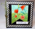
Stripes are so fun to use for DP and I think the contrast of these black and white stripes set at a diagonal really makes my bright water colors show up. I water colored the background and then added the stenciled flourish using distress ink. I flicked a little bit of watered down black paint on the background for texture. I die cut the poppies on white water color paper and had fun bringing my plain die cuts to life with water colors. I lined the card layers with a gold metallic paint pen.
Date: Thursday, July 21, 2016 GMT Views: 740
Favorited:7
Splitcoast Dirty Dozen Alumni SCS Gallery Moderator Splitcoast Challenge Hostess Teapot Tuesday TEAm
Registered: July 27, 2007 Location: Dublin, Ireland Posts: 132007
Fri, Jul 22, 2016 @ 3:50 AM
Into my favourites - I think this is just beautiful. As well as the great colour contrast between the stripes and main panel, I like the contrast between the lines and the softer flow of the flowers.