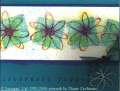
As I was driving to work one day I saw a sign for a new housing development that really caught my. As I sat there I realized Almost Amethyst and Mellow Moss came were the colours of the sign. That night I came home and made this card. In this picture the flowers look like a light blue but they are actually Almost Amethyst. Don't you find yourself translating colours into SU colours?
Date: Sunday, August 29, 2004 GMT Views: 4367
Favorited:71
Registered: June 13, 2004 Location: Flemington, NJ Posts: 3860
Mon, Aug 30, 2004 @ 5:29 AM
Love hearing your inspiration for this card-it is lovely! I also would like to know what you used over each flower center - appears to be a window sheet cut from a circle punch? Fabulous card & use of this set!!
Registered: July 28, 2004 Location: California Posts: 459
Mon, Aug 30, 2004 @ 8:08 AM
Very pretty...love the flowers cut out. However, the green paper is not SU...SU's paper has no texture. Are you sure it's not Bazill or that Hero Arts paper? I wish SU had more textured papers but they don't.
Registered: July 26, 2004 Location: Oregon Posts: 3056
Mon, Aug 30, 2004 @ 9:39 AM
Absolutely charming, so nicely done! I can TOTALLY relate to you in regard to translating things to SU colors - My latest card colors were inspired (not by "red and pink") but by a "Rose Red and Cameo Coral" colored carnation I saw in a bouquet! LOL!
Registered: June 22, 2004 Location: Mission Viejo, CALIF Posts: 7650
Mon, Aug 30, 2004 @ 11:02 AM
I think the paper Tracy used is Mellow Moss, but during scanning some paper gets lines in them. Either way, the card is so elegant, and has just a flavor of the tropics to it! Great job!
Tandra
Registered: April 5, 2003 Location: Whidbey Island, WA Posts: 22041
Mon, Aug 30, 2004 @ 11:19 AM
class all the way on this beautifully executed card!
------------------------------ Julie Ebersole (JulieHRR once upon a time . . . )julieebersole.com"So shines a good deed in a weary world." -Willy Wonka