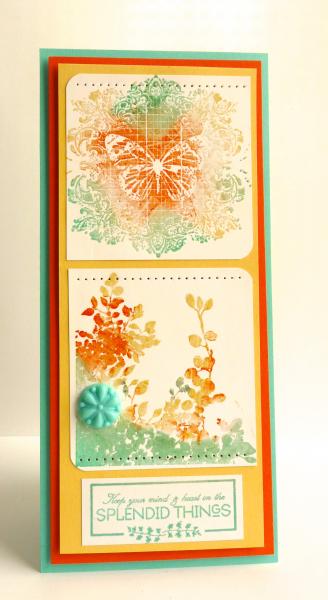
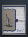
I titled this as such because I have trouble heat embossing. Is that goofy or what?!! Anyway, I embossed the bottom image about 5 times, the top 2 or 3. This creation slowly drove me out of my mind. I insisted on using both images since I went to so much trouble. So there you have it a double decker card or a tall and skinny. I'm just glad it's finally done.
Date: Tuesday, January 28, 2014 GMT Views: 2138
Favorited:16
Registered: March 15, 2012 Location: Alabama Posts: 11018
Tue, Jan 28, 2014 @ 2:59 PM
Oh my gosh Kim! Your card has so many things to LOVE!!! Of course I love the color palette! So many beautiful cards in this week's color gallery. But, I have to say, your use of the colors is so interesting (in a GREAT way!) and the images are too! On your butterfly panel, the image takes up almost the whole area and there are the lines in sort of a grid like pattern. Whereas on the lower panel, completely soft and flowing with a good bit of "white" space left. Then the kicker, you combined the two! They go perfectly together because the colors unite them and we know butterflies flutter over the meadows. I LOVE this, very pretty and creative! So glad you shared!!!
Registered: November 7, 2006 Location: Willamette Valley Oregon Posts: 34508
Tue, Jan 28, 2014 @ 3:46 PM
it certainly doesn't 'LOOK' driven to distraction...it looks lush with depth, full of color. I love how you often use the rounded corners, neat movement and this time how those said curves are alternated. Very playful and effective. And pretty too
------------------------------ Susan~~~One4Joydaily I'm a FAN CLUB member, U? MY GALLERYof visual Delights MY BLOG


 . Tfs
. Tfs