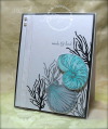
I chose white, gray, and black for my three neutrals, and added blue for my pop of color.
I stamped my images in Memento Tuxedo Black and Gray Flannel, and then colored in using Copic markers C3 and C5, and then B000 and B0000 for my blue shades.
I added some sheer ribbon and pearls for my embellishments.
This is also for Flourishes' Timeless Tuesday #222. The layout is Case Study #142.
Thanks for looking!
Date: Sunday, June 2, 2013 GMT Views: 3338
Favorited:12
Registered: August 21, 2007 Location: Wayland MA Posts: 105224
Mon, Jun 03, 2013 @ 10:15 AM
Perfect. That blue really pops!
------------------------------ Anne HarmonFS154, QFTD58, PROUD FAN CLUB MEMBER (photo of our Great Granddaughter Elise, just 6 months old) and me, even older.
Registered: January 6, 2004 Location: Connecticut Posts: 20543
Mon, Jun 03, 2013 @ 5:56 PM
What a lovely card! I love the pop of turquoise!
------------------------------ Rediscovering the simple joy of stamping and exploring my art! Stamp your ART out! Share your thoughts. Let your heart sing.
Come check out my Gallery and leave a comment!
FS465