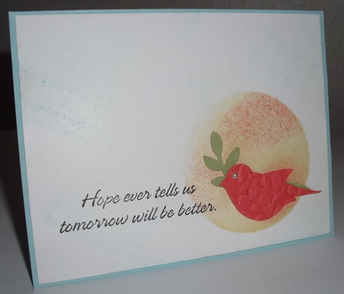
Well this is my 5th attempt at using these colors.. I guess that goes without saying why they call it a "challenge". This is for the CAS190 color challenge to use Coral, Yellow, White and Aqua.
I finally decided on a sympathy card and used the colors like a sunset. The sentiment is from a 1998 Stampin up set called Peace and Comfort.
TFL!
Date: Monday, October 1, 2012 GMT Views: 1835
Favorited:4
Registered: October 21, 2010 Location: in the okanagan in b.c. canada Posts: 13012
Tue, Oct 02, 2012 @ 12:27 PM
I love your encouraging sentiment...perfect for a time like that...:0). When I make sympathy cards I never know whats good to put, but as this week in receiving many cards of love and wishes, words liek this , nice and simple, but they are so comforting and helpful...so I know this will definitely be a blessing to whom it goes to...I think its a good idea how you used the colors in that pretty bg...the oranges and close to are not my best colors either...so I understand...well done...:0)..TFS
------------------------------ We as people are raindrops of colorful ink , falling down Crisp and Clear, each a different shade more vibrant then the last, but once we realize at the bottom of an endless abyss we all fall into the same inkpot forming one color, only then can we come together as one My son.