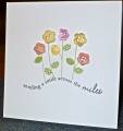
This is my third try at Judy's technique -- inspired by Belleek Pottery. On the first two my ink was too dark. I finally used Tim Holtz Distressed Antique Linen, and that gave me a subtle enough look. I stamped the image and sentiment in the same ink.
Date: Sunday, January 22, 2012 GMT Views: 3841
Favorited:17
Splitcoast Dirty Dozen Alumni SCS Gallery Moderator Splitcoast Challenge Hostess Teapot Tuesday TEAm
Registered: July 27, 2007 Location: Dublin, Ireland Posts: 131759
Mon, Jan 23, 2012 @ 9:37 AM
That's so funny, I started out with Antique Linen and thought it was too dark!! Guess it's all relative to your start point, because I certainly like how that ink looks on yours and Kittie's. I have two rejects too, although I'm sure they'll work with other cards, just not for the TLC.
Registered: August 21, 2007 Location: Wayland MA Posts: 105214
Mon, Jan 23, 2012 @ 11:21 AM
Gorgeous! The ink is a fab choice!!!
------------------------------ Anne HarmonFS154, QFTD58, PROUD FAN CLUB MEMBER (photo of our Great Granddaughter Elise, just 6 months old) and me, even older.