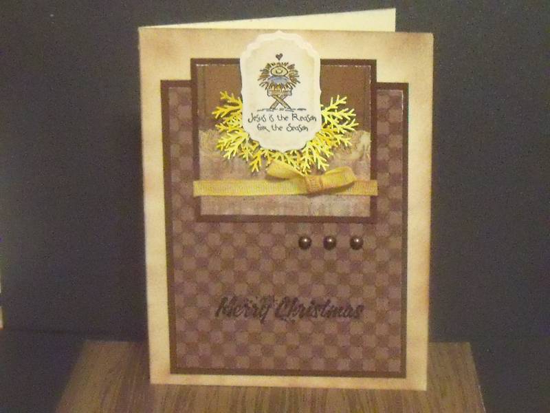
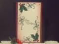
This is for the challenge of today being Roxie's awesome sketch. funny one for me today, turned completely around...lol...was going to start with a little cute pic, and bright and cheery, then saw this little stamp I havent used yet so thought a good time to try it out.
I saw the little manger and then thought i would add a bit of "straw" a bit around it like its sitting in it. It didnt work on crisp white or anything, so went with some wood looking dp so it was like the manger stall...lol..so came the browns...lol..so now I am looking at it and its not a fun cheery card at all...lol...still cute I guess..still not sure what it needs but thought I would just stop, I think for learning purposes my bottom layer is a bit big and too spacy something doesnt seem right, unless its just not cheery christmas color I am used to...not sure if you have ideas I am not minding truth or ideas at all...and Thanks for visiting...:0)
Date: Wednesday, November 9, 2011 GMT Views: 974
Favorited:2
Registered: July 16, 2009 Location: Washington State Posts: 1570
Wed, Nov 09, 2011 @ 9:42 AM
It's perfect, the straw is so sweet and I can't help but think of "Gold, Frankincense and Myrrh when I noticed the three pearls. Your scene is a wonderful (def: a cause of astonishment or admiration) representation of a "Lowly" manger.
Registered: August 21, 2007 Location: Wayland MA Posts: 105274
Wed, Nov 09, 2011 @ 9:53 AM
The yellow punches mimic the hay beautifully!
------------------------------ Anne HarmonFS154, QFTD58, PROUD FAN CLUB MEMBER (photo of our Great Granddaughter Elise, just 6 months old) and me, even older.
Registered: August 18, 2008 Location: Belfast, Northern Ireland, UK Posts: 31972
Wed, Nov 09, 2011 @ 1:28 PM
I think the way your card turned out gives complete emphasis on the baby in the manger and the other panels give a natural bg which is really meaningful and right! Such creative use of the branch punch to make hay!
Registered: September 3, 2007 Location: native Texan living in extreme N. GA Posts: 73400
Wed, Nov 09, 2011 @ 6:57 PM
What an adorable little image! I think you did a terrific job. Your card is wonderful and lovely just the way it is. I know it's sometimes harder to manage a small image so a lot of times, if my image is small like this, I'll make the layer a little larger and add a second one behind it. Just to give it more importance. For the second (backing layer, I'd probably use a slate blue about the color you used in the blanket). Then adjust the sizes of the next layers down a bit in size. Just an option and you may not even like it, but there you have it.