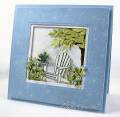
This is for CC320 to use Certainly Celery, Bashful Blue and Baja Breeze. I kept trying to figure out if I wanted Bashful Blue or Baja Breeze to be the dominate color for my project. To me they sort of do battle with each other. I decided to go with the lighter blue and let the greener blue be accents. I used a light wash of Baja to paint the chair and punched tiny little flowers from Baja for the pot on the chair. I made my larger fowers for the garden out of bashful and love how well the blue and celery go together.
Stamps: SU Pleae Be Seated
Ink: Black Versafine, Bashful Blue, Baja Breeze, Adirondack Latte
Paper: SU DP, Bashful Blue, White, Celery, Watercolor
Accessories: MS PIne Punch, McGill Leaf Punch, 3/8 and 1/8" Punches, Snips, Stylus, Piercing Mat, Stickles, Brush, Glossy Accents, Nestabilities, Mounting Tape, Cloud Template, Sponge
Date: Tuesday, April 26, 2011 GMT Views: 2365
Favorited:40
Registered: June 29, 2004 Location: Sugar Land. Texas Posts: 79895
Tue, Apr 26, 2011 @ 7:54 PM
I just love this, Ms Kittie!
------------------------------ LizThe joy of the LORD is my strength.Right Brain Madness --My blogProud member of the redDivasKSS certified multi-step stamperFan Club member since 2004