Registered: July 13, 2004 Location: Grasonville, MD Posts: 7632
Fri, Jan 06, 2006 @ 7:11 PM
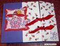
Brutallt Honest....Maybe the scanned image is a little off -The color that is coming up looks more like brown than real red, so I agree with the others that the colored image doesn't really go with the cardstock, but it looks like a scanner problem. Love the layout. Your cards are always very neat!
Registered: December 7, 2005 Location: State of Denial Posts: 3518
Thu, Jan 12, 2006 @ 1:07 PM
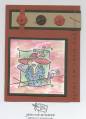
i love the watercolors, i think the card stock colors would be fine if the colors of the buttons were brighter. that would balance the card. i like the way the pictures pops off the card because of the bright colors. the way you colored the background is beautiful.
Registered: August 21, 2005 Location: Beautiful New England Posts: 1145
Fri, Jan 13, 2006 @ 12:30 AM
Honesty thread: I think this is a nice layout, and the colors you listed would look great, so I bet it is a winner!--I think the clors are so off in the pic that it looks strange, cause we all know the Red Hatter colors to be more vibrant and the pic looks more subdued.