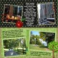
This is for the Stark Contrast challenge. I tried to show the contrast between New York City and what most of the rest of the state is like. It also qualifies for JennÂ’s tree challenge. For me, this was the toughest digi-challenge yet. I had an idea, but had trouble creating it on my page. But, as they say, whatÂ’s done is done!
Credits:
-Spirit of Summer Charity Collab for Australian Bushfire Appeal
find kit here: http://digilovers-addiction.blogspot...-surprise.html
(I used elements in the kit from Neparko of Desert Designs, CRK and Flergs)
-Black Dotty-Anna Russell
-Gem-Bohemian Art (www.scrapartist.com)
-Apple-searched google images
Thanks for looking!
Date: Friday, April 17, 2009 GMT Views: 852
Favorited:3
Registered: May 18, 2008 Location: Virginia Posts: 24623
Sun, Apr 19, 2009 @ 4:43 PM
Wendy, you may have suffered, but we are reaping the benefits of your fantastic layout! You had a great idea and were able to express it through your beautiful layout. I know what you mean, I always thinks of NY as the "big city" and it really is majority rural. You really brought that concept home! Fabulous job! TFS!
------------------------------ Pam Co-Founder of The Punchkateerz! Fan Club Member FS149, QFTD44