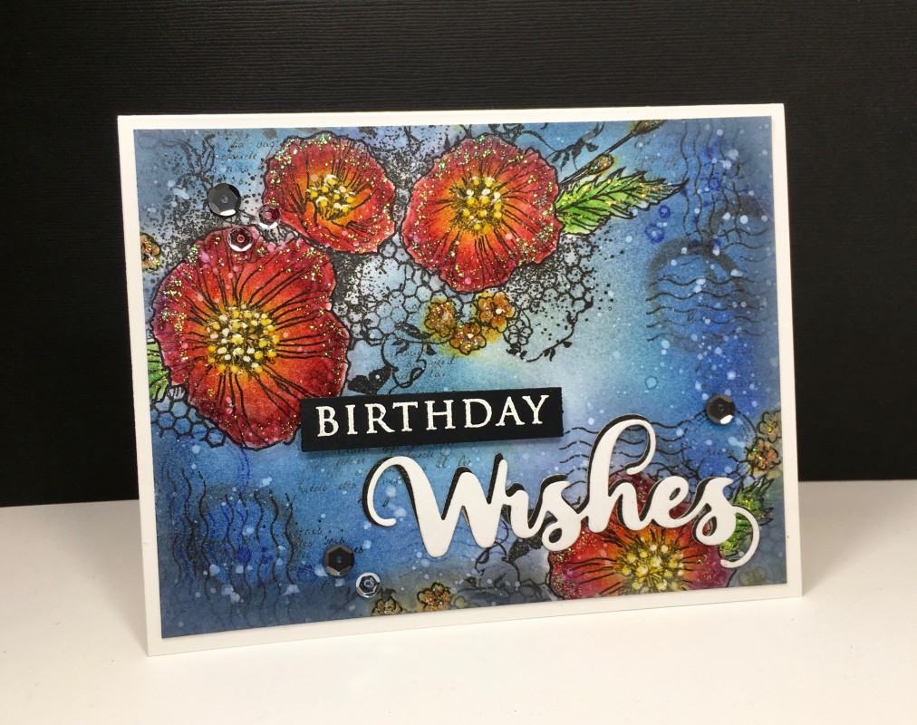
I was inspired by both the bold colors in this image on our inspiration site today: here, and by the bold use of color and design elements in the inspiration image at Time Out Challenges here.
Stamped the flower image and sponged all the color on, using my hand-made mask when necessary. Added some grunge mixed media stamping and then sponged some more around the edges to create depth and interest. Splattered a bit of white acrylic paint, added some outlining to the flowers, and also some stickles for some sparkle (that detail looks much more subtle IRL). Added white enamel accents to the stame, but my bottle was old and it looked more yellow, but I think it still worked. Die cut the sentiment twice (one in black, one in white), so I could slightly offset them to make it pop more, and embossed the "happy" on black. Popped up the "happy" and added sequins.
Splitcoast Dirty Dozen Splitcoast Challenge Hostess Proud Fan Club Member
Registered: January 27, 2010 Location: Southern Ontario, Canada Posts: 52226
Sat, Feb 25, 2017 @ 12:34 PM
Goodness Maura, I about fell off my chair when I saw this. This is amazing ... each detail adding more interest and depth, and then the addition of some sparkle, I love it all. Gorgeous work my friend ...