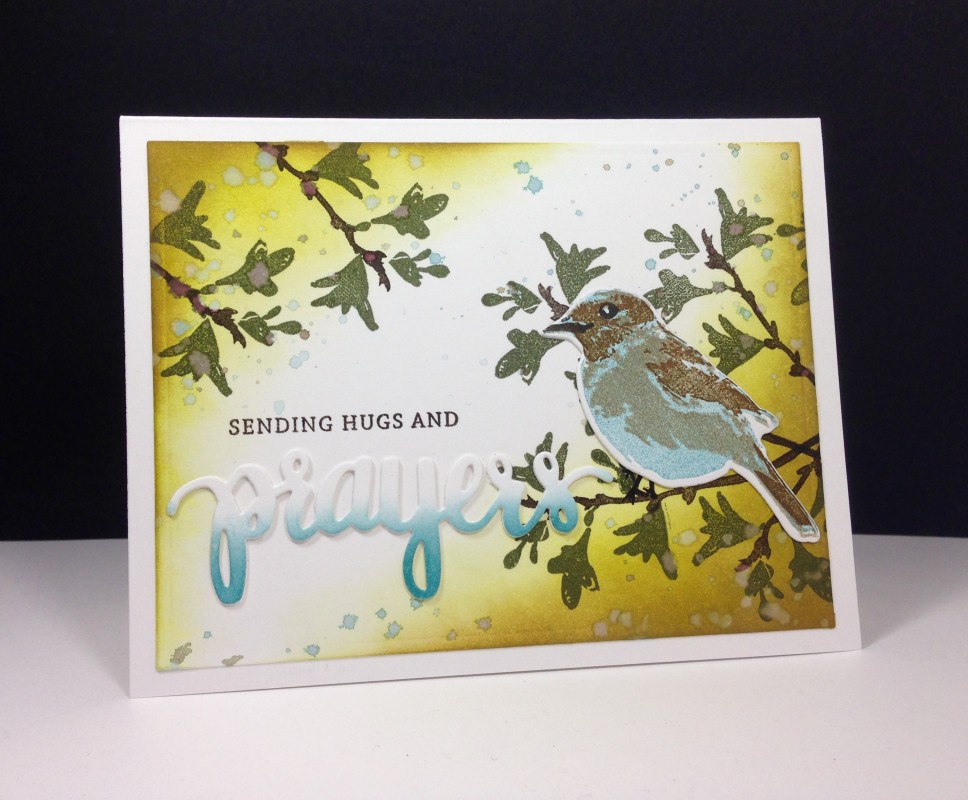
On our inspiration site today I found this bird image: https://2.bp.blogspot.com/-QCNDlJU-v...tzmarkers2.jpg
I am not a "journal-er," so I am going with option 1. I made a card that was similar to this a while back but I wanted to make a different version that would capture the more distressed/vintage looks of so many images on this site.
Stamped the branch and leaves several times, layered the stamping on the bird, and then sponged on the main panel as well as on a portion of the word prayers (love the look of this partial sponging). Splattered the card colors (diluted with water) with a paintbrush and assembled.
Registered: August 15, 2007 Location: Twin Cities MN Posts: 50705
Sat, Apr 02, 2016 @ 10:59 AM
Beautiful! I like the partial sponging on the word..very cool...and I love the look of the warm yellow color in the corners...gives your card a wonderful light.
Splitcoast Dirty Dozen Splitcoast Challenge Hostess Proud Fan Club Member
Registered: January 27, 2010 Location: Southern Ontario, Canada Posts: 52196
Sat, Apr 02, 2016 @ 11:05 AM
That background is gorgeous Maura - but the show stopper for me is the birdie - I love that little birdie. I also love the way you did "prayers" - beautiful work.
Registered: August 30, 2010 Location: India Posts: 5
Sat, Apr 02, 2016 @ 11:14 AM
Oh My! Your card is beautiful! The distress colouring, the beautiful die cut, the bird...everything! Love it all!Thank you so very much for playing along at Paru's Card Making challenges!
Registered: February 3, 2005 Location: Delray Beach, FL Posts: 34769
Sat, Apr 02, 2016 @ 11:16 AM
Maura, this is gorgeous, and I agree that your background is amazing! What a precious little bird and a lovely sentiment - prayer is so powerful! Hugs, sweet friend!
------------------------------ Cheryl
Proverbs 3:5-6 My blog