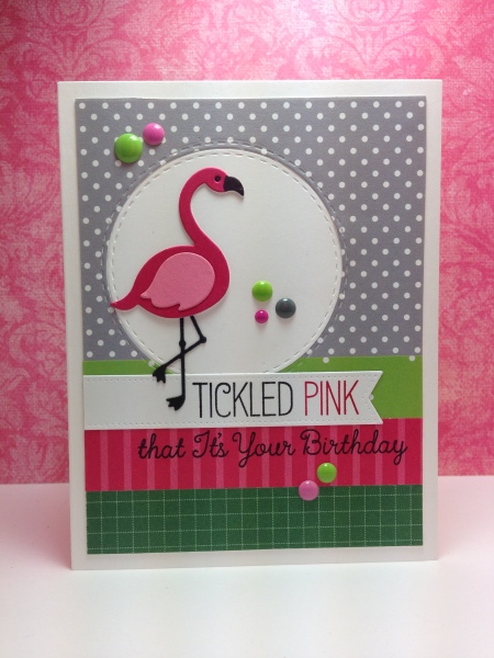
This was so perfect that today's challenge (WT544) is to focus on the left side of our card, and this happens also to fit with the sketch I was using today (woo hoo!). I think the card itself is pretty self explanatory. Did some masking for the 2 color sentiment, and cut it apart so I could stamp it separately. Die cut 2 flamingos so it would have a little more depth.
Although the second part of the sentiment looks slightly out of focus, it is perfectly clear IRL. I have found that for some reason, if I stamp in black on a saturated color background this happens - and I don't know why. If anyone has any thoughts on how to remedy this, I would love to hear them.
Registered: January 14, 2013 Location: Devon, England Posts: 372
Thu, Aug 13, 2015 @ 7:22 AM
I'm not into pink this card is still lovely & the flamingos looks great with the different coloured wing as it stands out. I like the added touch of the enamel dots too.