Registered: October 21, 2010 Location: in the okanagan in b.c. canada Posts: 13012
Mon, Apr 09, 2012 @ 5:13 PM
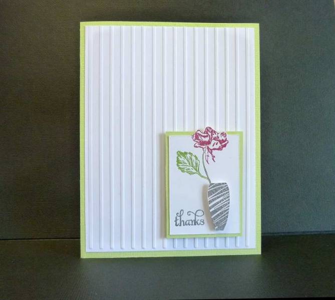
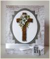
so pretty. I am starting to like more and more the lots of white on cards...just have to get past that thinking of that corners or spots look bare...lol..becaseu like here sometimes less is more...Beautiful job...TFS..:0)
------------------------------ We as people are raindrops of colorful ink , falling down Crisp and Clear, each a different shade more vibrant then the last, but once we realize at the bottom of an endless abyss we all fall into the same inkpot forming one color, only then can we come together as one My son.
Registered: July 9, 2008 Location: Stars Fell on Alabama Posts: 75038
Tue, Apr 10, 2012 @ 10:06 AM
Jo, this is such a pretty and sweet vase with the lovely flower. I like your bloom out of the box. CAS and beautiful.
------------------------------ My Blog---My Gallery---My PinterestI'm a Punchkateer! (Prez) FOREVERDirty Dozen Alumni2014 CAS Spring DT--- Inspiration Challenge Co- Hostess 12/02/17-12/28/19 Watercolor Wednesday Design Team Hebrews 13:2Brenda
Registered: May 18, 2008 Location: Virginia Posts: 24623
Tue, Apr 10, 2012 @ 3:41 PM
WOW, this is one of the softest and beautiful CAS card I've seen Jo. Less is more on this one for sure. I would have messed it all up with goop and what not. I really LOVE it!
------------------------------ Pam Co-Founder of The Punchkateerz! Fan Club Member FS149, QFTD44
Registered: February 15, 2006 Location: Posts: 570
Sun, Apr 15, 2012 @ 7:05 AM
Love this card. It's all about the details. The stamp is simple, yet elegant, love how you cut the stamp out with the top outside the square, love the lines in the base, love the popped vase. Beautiful card!