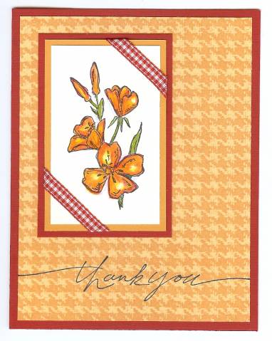
This is the first one I did and had more of a clean-cut appearance. I also cheated on the challenge a little by using So Saffron by accident and I added darker yellow ochre cardstock. Oh well! The card is lacking a little balance because the words are so delicate. It could have used a heavier font.
Date: Monday, January 2, 2006 GMT Views: 907
Favorited:10
Splitcoast Dirty Dozen Alumni Creative Crew SU Design Team Alumni
Registered: May 8, 2003 Location: Centerville. Ohio Posts: 6163
Mon, Jan 02, 2006 @ 4:48 PM
They are both great but I think the way you use the ribbon on this card really makes it stand out!
------------------------------ Mary Brown aka stampercamper - Senior Supervisor
Team Member of CREATE with Connie and Mary
Check out my BLOG at http://stampercamper.com
Creative Crew SU Design Team, Spring 2012 CAS Design Team member
Registered: June 26, 2005 Location: Some where in my stamping studio Posts: 11521
Mon, Jan 02, 2006 @ 6:43 PM
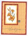
I like this one better also because of the ribbon, maybe if you put the flower in the middle it will balance out the thank you, and it won't make the thank you look so delicate??????
Both are great cards! TFS!
Registered: August 9, 2005 Location: Tampa, FL Posts: 16812
Tue, Jan 03, 2006 @ 10:39 AM
They're both very pretty, but I like this one better, more elegant!
------------------------------ Jerri Kay My Gallery My Blog - A Touch of Grace Shout to the Lord, all the earth let us sing, power and majesty, praise to the King!