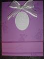
I made this anniversary card today, embossing for the first time. The center bell is embossed with Winter Wonderland Embossing powder. (you can't really see it in the picture.
Date: Saturday, December 31, 2005 GMT Views: 1347
Favorited:5
Registered: August 20, 2004 Location: Posts: 24944
Thu, Jan 05, 2006 @ 2:11 PM
For the honesty thread: What if the center bell is embossed in black with the layered "love piece" layered onto black instead of darker purple with a gingham black ribbon instead of the organdy? I really like the design... all the purple sort of "blends" though, kwim?
Registered: July 18, 2005 Location: officially single again and BACK in PA!!! Posts: 7741
Thu, Jan 05, 2006 @ 2:14 PM
Brutal honesty - it needs something light (white/silver) on the bottom to balance it out. How about a larger mat under the sentiment strip? And maybe the darker purple as another mat under the embossed bell part?
Registered: June 21, 2004 Location: NE WI Posts: 19206
Thu, Jan 05, 2006 @ 2:38 PM
Time for some brutal honesty...the bell doesn't pop out enough...maybe embossed on a different color like the darker purple with a lighter purple mat under. I like the layout
------------------------------
*Mandy* Heading to the Southern Caribbean!!
Just earned Alaska 2/27/10!!
Registered: January 14, 2005 Location: Posts: 7516
Thu, Jan 05, 2006 @ 3:10 PM
brutal honesty... I think it needs a mat for the oval with bells (maybe that darker purple) and also, the strip with "love" I would have used White paper. I love that beautiful ribbon, though!
Registered: November 6, 2003 Location: Omaha Posts: 3430
Thu, Jan 05, 2006 @ 4:06 PM
honesty thread... I think the "love" should be on the same paper as the silver bell... or add a mat of a different color (like black as suggested) and then bring that to the bottom part as well. I think it's a pretty card though!
Registered: February 23, 2005 Location: Red Sox Nation Posts: 12105
Thu, Jan 05, 2006 @ 6:05 PM
honesty thread...I agree with everyone else, great layout but the bell and "love" just melt into the background. They need to pop. I liked mamak's idea of embossing in black. Also think the mat for the love should be the same as the bell.
------------------------------ Debbi - SU Demonstrator My SU Website
Visit me on Facebook
Splitcoast Dirty Dozen Alumni Splitcoast Gallery Moderator
Registered: July 19, 2004 Location: Colorado Posts: 24169
Thu, Jan 05, 2006 @ 7:09 PM
honesty... I agree, the bell should be the focal, but it doesn't pop on the white. If you have that color in craft then you could still emboss it. Otherwise, maybe white emboss on purple paper and mat with a thin white? And then the greeting in white.
Registered: November 26, 2005 Location: New Jersey Posts: 2360
Thu, Jan 05, 2006 @ 7:44 PM
Honesty thread - the layout is balanced and pleasing. You just need some color contrast to highlight your focal point. Right now it's the ribbon. If you want the bell to be the focus, do as suggested and emboss it in a darker color - black or purple. Ditto on the "love" message. The purple on purple disappears into the background. Maybe try it on Pale Plum? Or another pale purple?
------------------------------ Stamping with a cat - Fur is a fiber | Ribbon is a cat toy |Eyelets are for batting | Glitter is a fashion statement My Photography
BH..the bell does not show up well enough. Had to squint to see that it was a bell, however I am sure in person it is easier to see. Darker color bell or on another color paper?? Cute card.