Splitcoast Dirty Dozen Alumni Splitcoast Gallery Moderator
Registered: July 19, 2004 Location: Colorado Posts: 24169
Fri, Jan 06, 2006 @ 6:31 AM
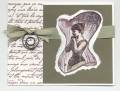
Honesty: I like it. I can't tell if this is really necessary since you say it is washed out, but maybe mat the whole thing in another layer of Mauve? Love the flowers in the cage -- great idea!
Registered: January 26, 2004 Location: Virginia Posts: 34652
Fri, Jan 06, 2006 @ 7:42 AM
brutal honesty thread: I think this is really good! The little brads are perfect! I would only maybe put it on a layer of mauve just to set if off a bit more. Great card though!
Registered: May 2, 2004 Location: Far, far away Posts: 24216
Fri, Jan 06, 2006 @ 2:13 PM
Brutal honesty: I think this is a great card that got overlooked because the photo doesn't do it justice. It wouldn't stand out as a thumbnail, but when you view it closely it's great! Nothing to change, IMO!
Registered: February 23, 2005 Location: Red Sox Nation Posts: 12105
Sun, Jan 08, 2006 @ 11:22 AM
Honesty thread: this is a lovely card. Since you said the colors got washed out in the scan (hate it when that happens), that's probably why it got overlooked. I love the layout and the brads are really cute. I would have said use a darker color, but since the computer "washed" the colors, I'll bet it's just perfect IRL.
------------------------------ Debbi - SU Demonstrator My SU Website
Visit me on Facebook
Registered: November 6, 2003 Location: Omaha Posts: 3430
Tue, Jan 10, 2006 @ 5:37 PM
honesty thread: I think it's cool! I agree that the whole card could be layered on another piece of mauve. one other suggestion (take it with a grain of salt cause maybe it wouldn't look right!) but you could tie a piece of ribbon around the top area and the sentiment layered over top of it and it would be tied so the bow would be to the right of the sentiment piece (make sense?)