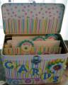
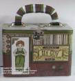
This design was intended for younger folks (fund-raiser was for a school), using bright colors and cards inside were all assorted, not matching the outside papers. Letters were QK - Zelda font
Date: Saturday, July 26, 2008 GMT Views: 1062
Favorited:6