Registered: February 3, 2006 Location: on the Dog Ranch up in CANADA Posts: 366
Fri, Jul 18, 2008 @ 2:22 PM
IMHO I think it needs some ribbon, or something to make the sentiment pop...
Thanks for asking for comments, something I have not had the guts to do yet.
------------------------------ God grant me the space to put away the things I buy, The money to buy the things I want,
And the wisdom to know when to get rid of something, so I can get something else.
////*////*
Registered: June 7, 2005 Location: MA/NH border Posts: 13409
Fri, Jul 18, 2008 @ 2:38 PM
I think you've got a pretty start here! (Since you asked), I might suggest adding either a piece of ribbon or cardstock to separate the top and bottom sections then pop up your focal piece over that with pop dots or dimensionals to make it stand out a little more. TFS!
------------------------------ If you get and appreciate comments, leave comments! Pay it forward....You'll make someones day!
Registered: January 21, 2005 Location: I escaped from NY! I ♥️ my new state of SC! Posts: 22756
Fri, Jul 18, 2008 @ 4:45 PM
I like the design and agree with other posts about making the layered panel pop and defining the stop and start points.
Really nice colors and they'd look nice with some glitter in the flower's center. All in all, I smiled when I looked at your card. Thanks for sharing (and being brave enough to request comments).
Registered: January 31, 2008 Location: Arkansas Posts: 1799
Fri, Jul 18, 2008 @ 7:09 PM
love the stamps...I think a ribbon right above the sentiment sorta under the image would add alot to the card...and stickles..ROFL...anyone who looks at my cards KNOW I love stickles..ROFL
Registered: January 1, 2008 Location: Germany Posts: 873
Sat, Jul 19, 2008 @ 2:38 AM
Yeah, and here's the medical comment: Our eyes always search for frames because frames make fusion easier (fusion is the process of making a whole visual impression out of the two different images the right and the left eye deliver to our brain). Your card lacks such a fusion help, our eyes "search" about the card with its repeating pattern. Especially when you use repeating patterns (and not a scene) you NEED such a frame (just put your design not directly onto the card but onto a piece of cs and mat it with a contrasting color cardstock onto the card, or even draw a frame around the design!). It will look much better then - that's what alle the others told you before, but I wanted to explain to you WHY this is the thing...
------------------------------ Please visit my gallery or blog! Thank you! Christiane
Do not grow weary - but gently - to the wonder - as if a bird should light - hold out your hand. (Hilde Domin, 1909-2006)


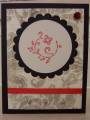
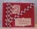


 You could also stick some dimensionals under the focal image, those are always fun