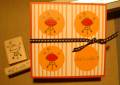
My interpretation for the AMuseapalooza challenge--color combination inspired by the Vera Bradley Seaside tote. That's supposed to be red polka dots on the background paper. The photo makes them look a bit orange.
This was a welcome break from my current project--calendars for 2009! TFL!
Date: Tuesday, June 10, 2008 GMT Views: 535
Favorited:3
Registered: September 7, 2005 Location: The 5280! Posts: 10329
Thu, Jun 12, 2008 @ 4:03 PM
Very cute! tfs!
-t
------------------------------ Tenia Nelson Thanks for the lovely comments!!
My Blog:Jazzy Paper Designs Summer 2012 CAS DT Member
Currently designing for some great companies!!!
Registered: April 5, 2003 Location: Whidbey Island, WA Posts: 22041
Thu, Jun 12, 2008 @ 7:15 PM
Great job!
------------------------------ Julie Ebersole (JulieHRR once upon a time . . . )julieebersole.com"So shines a good deed in a weary world." -Willy Wonka