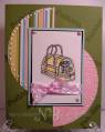
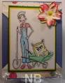
Playing with some of my Stamped images that I recieved from WRAK group"
This one is from Hanna Stamps.
___________________________________
I started out with coloring the images and then cutting out the wheel barrown & Dirt Bag.
I then picked a color of Cardstock and Designer Paper (Daisy D). Ivy Green Bazzill Cs, Yellow CS,
I layer the Ivy, Yellow and White together.
I also took the Daisy D paper and cut it to fit the Blue CS base, I took my Paper Poker tool and poked holes in the Blue cs, and Daisy D Paper.
And to finish the card I made a Flower out of Punched flowers Sponged Red, Blue Pink, and Landscape Palette inks and then added a gold brad and some Yellow Stickle.
Date: Monday, June 9, 2008 GMT Views: 698
Favorited:4
Registered: July 20, 2006 Location: Heart of Dixie Posts: 1404
Wed, Jun 11, 2008 @ 5:36 PM
I love your card!.. but.. ;) I'm having a big problem with the big flower tugging my eyes away from your images. Perhaps maybe omit the flower because your images take up a lot of room too, and your base layer is so unique -I love it, btw. Instead, perhaps a sunshine or a few small flowers, rocks or grass sprinkled on the ground? I could be all wrong, so please don't get upset. Maybe one of our experts will set me straight! I LOVE the gardener! TFS! May God bless, Sandi
------------------------------ StormyElf'd '07Humble Ink Smears If at first you don't succeed, talk to God! Then, go put on your big girl panties!
Registered: March 2, 2008 Location: Folsom, CA Posts: 9567
Wed, Jun 11, 2008 @ 8:04 PM
I think your coloring and shadow technique are great, but I'm also one that thinks the flower doesn't go with the image. As a gardner, I love flowers, but again I also agree with SouthernStorm that some grass, flowers, maybe a smudge of dirt would have said more about the image. When I look at cards I try to imagine what the artist (you) wanted me to see - what is the focus? The flower or the gardener? I hope I didn't offend.