Registered: May 5, 2004 Location: Rochester MN Posts: 48
Mon, May 24, 2004 @ 10:28 PM
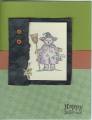
I have a great time with color combos. Most of my cards feature colors that are striking together. Not all of them scan very well though. The lighter the color, the harder it is to see on the screen. This one is made up of CLose to Cocoa, Creamy Carmel, Barely Banana, Blush Blossom, Bordering Blue, and Ivory.