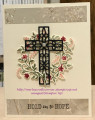
I had a difficult time choosing, yet in the end it was easy. The stamp I used has the verse at the bottom - I don't always want to use it that way. So I masked it to stamp image and verse separately (they are a bit too close to just cut apart). I also have not always been happy with coloring, so was glad to try the black and white version.
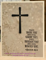
I actually changed very little this time Colors are about identical, as is the layout. My image and sentiment are a bit different.
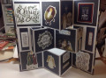
Silke used brads. Since it looked like they were on the card base, I did not know how she did it so the "legs" were not on the inside of the card. I used my eyelet punch to make faux brads out of some texture paper.
Date: Sunday, April 20, 2008 GMT Views: 546
Favorited:2
Registered: March 21, 2006 Location: sunny southern california Posts: 20098
Sun, Apr 20, 2008 @ 8:31 AM
Very Nice, Dorothy. I agree, this image is great as an outline image - it brings foculs to the sentiment that way! Like the sketch alot!
------------------------------ christine m.aka summer and weekend stalker DOT INK (My yadda yadda) Don't magnify your problem . . .Magnify your God
PROUD MEMBER OF THE REDDIVAS!